A service business in Frederick rarely loses a job because a competitor does better work. It loses because someone landed on a page, could not tell within a few seconds what to do next, and went back to the search results. That gap between a visitor and a phone call is where web design for lead generation does its work. The layout, the wording, the placement of the phone number, and the length of the form all decide whether a curious visitor becomes a name in your inbox or disappears.
Most local business websites are built to look finished rather than to capture anything. They describe the company, show a few photos, and end with a contact link buried in the footer. A lead generation approach flips the priority. Every page gets a job, and that job is always the same: make it obvious, easy, and low risk for the right person to raise a hand.
What a Lead Generation Website Actually Means
A lead generation website is an entire site designed around capturing leads, with multiple pages and conversion opportunities working together. That definition matters because it rules out a common shortcut. One well-optimized landing page is not a lead generation website. Neither is a homepage with a contact form and six pages of filler behind it.
The practical version is a set of pages, each carrying specific elements that move someone toward an inquiry. Design resources that collect examples, including published roundups featuring sites such as Databox, RedShelf, Lux Lights, Evernote, Ellevest, and Custom Built Design, are useful for spotting patterns: a plain statement of what the company does, a visible next step, and proof that other people already took it. Patterns are worth borrowing. The exact layout is not.
Orbit Media's collection of lead generation tips runs to dozens of items across websites, blogs, and content programs, which tells you the topic is broad. For a Frederick service business, though, the useful subset is narrow. Get these elements right on every page and the rest becomes refinement.
What Belongs on Every Page
The test for any element is simple. Does it make it easier for a ready buyer to contact you, or harder? If it does neither, it is decoration, and decoration can wait until the fundamentals are in place.
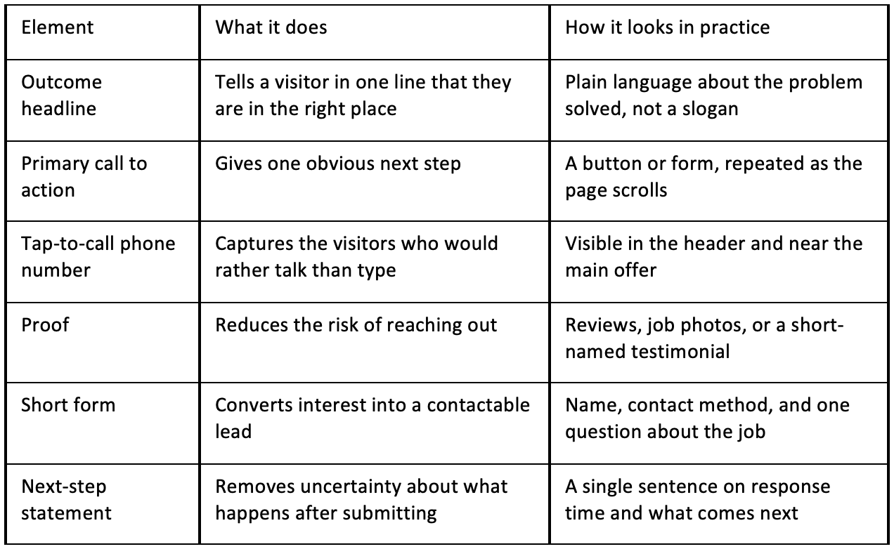
A Headline That States the Outcome
Visitors arriving from search or an ad are asking one silent question: can these people fix my problem? A headline about craftsmanship or family ownership does not answer it. A headline naming the service and the service area does. Keep the personality in the supporting line below, where it adds warmth without delaying the answer.
One Primary Call to Action, Repeated
Competing offers split attention and reduce conversions. If the goal is booked estimates, the primary action should be requesting an estimate. A newsletter signup, a downloadable checklist, and a "follow us" prompt can all live elsewhere on the page, but they should not compete with the main ask. Repeat the main action at natural stopping points: after the intro, after the proof, and at the close.
A Phone Number People Can Tap
Plenty of local buyers, especially in urgent situations, will not fill out a form. They want to call. A number that appears only on the contact page forces extra clicks and loses the impatient ones. Put it in the header, make it tappable on mobile, and keep it the same everywhere so nobody second-guesses which number is current.
Proof Placed Next to the Ask
Reviews and photos do more work when they sit beside the button rather than in a separate testimonials section three screens down. The moment of decision is the moment of doubt. Pairing a short review with the form gives a hesitant visitor a reason to continue without scrolling back to look for reassurance.
A Form Short Enough to Finish
Each field is a small tax on the visitor's attention. Name, a way to reach them, and a line about the job is usually enough to start a conversation, and the rest can be gathered on the phone. Long intake forms make sense for complex projects. For a routine service inquiry, they mostly generate abandonment.
A Clear Statement of What Happens After Submit
Uncertainty stops people at the final step. A single sentence explaining who will respond and roughly how quickly removes that hesitation. Avoid promising exact timeframes you cannot hold. State what is true and keep the promise small enough to keep.
Page by Page: Where Frederick Buyers Decide
The elements above apply everywhere, but each page type carries a different weight in the decision. Treat them as separate jobs rather than copies of the homepage with the headline swapped.
Homepage
The homepage serves strangers and returning visitors at once, so it needs to orient quickly. State the service, the area, and the next step above the fold, then use the rest of the page to route people to the service that fits them. Service links should read like the words customers use, not internal category names.
Service Pages
This is where most leads are won or lost, because search traffic tends to land here rather than on the homepage. Each service page should address one service, answer the questions a buyer would ask before calling, and carry its own call to action and proof. A page that covers five unrelated services dilutes all five.
About Page
Buyers who reach the About page are close to deciding. They are checking whether you seem credible and easy to deal with. Keep it short, use real photos, and end with the same call to action as everywhere else. A wall of company history without a next step wastes a page that was already doing well.
Contact Page
Contact pages fail for boring reasons: forms that break on phones, no phone number, no indication of service hours, and no confirmation that anything was sent. Test your own form on a phone and confirm the submission arrives. Then confirm the visitor sees a thank-you message rather than a blank reload.
Design for the Phone First, the Desktop Second
Local service searches happen on phones, often while someone is standing in a basement or looking at a broken fixture. Buttons need to be large enough to hit with a thumb, text needs to be readable without pinching, and the phone number should be one tap away. A layout that looks polished on a laptop and turns into a cramped column on a phone is not finished.
Speed belongs in the same conversation. Heavy images and stacked scripts delay the moment a visitor sees anything useful, and that delay happens before they have any reason to wait. Compress photos, trim what loads on each page, and check the experience on a mid-range phone rather than the newest model in the office.
Local Search and the Pages That Support It
Design and search visibility are usually treated as separate projects, which is why so many sites look good and rank poorly. A lead generation web design engagement connects strategy, user experience, SEO, conversion paths, and development, so the pages that attract search traffic are the same pages built to convert it. For a Frederick business, that means service pages written around local search terms, consistent business details across the site, and internal links that guide visitors toward an inquiry instead of a dead end.
How to Tell If the Design Is Working
Opinions about design are cheap. Behavior is not. Before changing anything, set up a small set of measurements so you can see whether the new version performs better than the old one.
- Form submissions and phone taps, tracked separately, per page
- Which pages people land on before they convert
- Where visitors abandon the form, if the tooling can show it
- Mobile versus desktop conversion differences
- Which service pages attract traffic but produce no inquiries
A page that draws steady traffic and no leads is telling you something specific. Either the offer does not match what searchers expected, or the next step is too hard to find. Both are design problems with design fixes.
Mistakes That Cost Leads Quietly
The expensive mistakes rarely look dramatic. A form that only sends to an inbox nobody checks. A phone number listed in an image instead of as text, so it cannot be tapped. A call to action that says "submit" instead of describing what the visitor gets. A confirmation page that never confirms. Stock photos of people who clearly do not work in Frederick. Copyright dates from years ago. None of these will show up in a design review, and all of them cost inquiries.
Fix the boring ones first. Then refine the layout with the measurements above as your guide, rather than a preference for one shade of green over another.
Frequently Asked Questions
How many calls to action should a page have?
One primary action, repeated several times down the page, works better than several competing offers. The visitor should never have to guess what the most important next step is. Secondary options such as a newsletter signup can exist, but keep them visually quieter so the main ask stays obvious.
Does a lead generation website need a blog?
Not necessarily. A blog supports a lead generation site by answering questions buyers search for and linking back to service pages, but it is not the engine. Service pages, clear calls to action, and working forms produce inquiries. Content helps more once those fundamentals are already in place and converting.
How long should a contact form be?
Short enough that a busy person finishes it on a phone. Name, contact details, and a brief description of the job cover most local service inquiries, with the rest gathered in conversation. Every additional required field adds friction, so only ask for information you will genuinely use in the first follow-up.
How do we know if a redesign helped?
Measure before and after. Track form submissions and phone taps by page, watch mobile behavior separately from desktop, and give the new version enough time to collect meaningful data. If a specific service page still attracts traffic without producing inquiries, look at the offer and the visibility of the next step before blaming the design overall.
Good web design for lead generation is less about visual trend and more about removing reasons to leave. A Frederick service business that states the outcome clearly, offers one obvious action, proves the work, and makes contact effortless on a phone will outperform a prettier site that asks visitors to work for it. Start with the pages that already attract traffic, fix the contact path, and let the results tell you where to refine next.